
Styles
Content styles used throughout Miami's Universal Sub-pages. All font sizes listed below are assuming that the font size on the body tag of the site has been set to 100%.
Headings
Apply a heading to text by highlighting text with your cursor. Then choose from the Format drop-down menu.
This is a Heading 1
Font: Georgia Roman, color: #B61E2E, size: 180%
This is a Heading 2
Font: Georgia Bold Italic, color: #000, size: 150%
This is a Heading 3
Font: Georgia Bold Italic, color: #B61E2E, size: 140%
This is a Heading 4
Font: Georgia Roman, color: #B9881E, size: 140%
This is a Heading 5
Font: Georgia Bold Italic, color: #B61E2E, size: 120%
This is a Heading 6
Font: Georgia Bold, color: #000, size: 110%
Paragraphs
Body content is generally Helvetica font. The color is black: #000
Example: We encourage you to explore the rest of our website and invite you to visit us here in Oxford. (See "Visiting Miami" on the left menu for directions, accommodations, and more.) If you are unable to stop by, visit ExperienceMiamiOH.com to discover why Miami a great place to call home. Robert Frost once identified our campus as "the most beautiful campus that ever there was." We agree, and we think you will, too!
Bulleted Lists
- List item 1
- List item 2
- List item 3
- List item 4
Link List with style of arrowBullets:
Numbered Lists
- List item 1
- List item 2
- List item 3
- List item 4
Table Options
Tables should only be used to display tabular data, not to layout the structure of a page. Within Cascade there are a couple of styles that can be applied to tables to change their look.
Example 1: The default table display with no special style applied:
| Column title | Column title | Column title | |
|---|---|---|---|
| Row title | Some information | Some information | Some information |
| Row title | Some information | Some information | Some information |
| Row title | Some information | Some information | Some information |
Example 2: A style of grayWhiteTable has been added to change the colors of the table rows:
| Column title | Column title | Column title | |
|---|---|---|---|
| Row title | Some information | Some information | Some information |
| Row title | Some information | Some information | Some information |
| Row title | Some information | Some information | Some information |
Example 3: A style of basicTable has been applied to remove all colors and extra spacing to create a plain table:
| Column title | Column title | Column title | |
|---|---|---|---|
| Row title | Some information | Some information | Some information |
| Row title | Some information | Some information | Some information |
| Row title | Some information | Some information | Some information |
Buttons
You can choose from a couple of button styles.
Red Button | use class="redButton"
Red Callout Button | use class="redCalloutButton"
Red Border Button | use class="redBorderButton"
Buttons can also be made using different Headings.
Red button with Heading 3
Images within Text
Images can be set within the Page Content to align to the left or to the right side of the text allowing the text to wrap around the image and have appropriate spacing around the image.
- Simply insert your image at the beginning of the page or the beginning of the paragraph you want your image to line up with.
- Click on the image so it is highlighted.
- In the Styles drop down menu choose leftImage or rightImage.
- Submit your changes to preview your content.
Example:
 Importunus opto quis bis suscipit olim vereor lucidus sudo humo mara. Secundum minim conventio augue vulputate sagaciter vulpes eum iriure dolore blandit ut. Ut te singularis nulla indoles loquor ad pala utrum capio at. Vel at jugis sed.
Ut eros adsum verto nisl eum hendrerit vereor singularis autem autem persto. Nostrud loquor vel zelus feugait venio sudo. Pecus humo bene erat zelus hendrerit. Damnum illum vereor secundum commodo distineo odio.
Metuo conventio valde at sino te. Venio commoveo jus et ullamcorper tincidunt ea ut. Abbas paratus duis pagus eros. Ut eros adsum verto nisl eum hendrerit vereor singularis autem autem persto. Nostrud loquor vel zelus feugait venio sudo. Pecus humo bene erat zelus hendrerit. Damnum illum vereor secundum commodo distineo odio. Ut eros adsum verto nisl eum hendrerit vereor singularis autem autem persto. Nostrud loquor vel zelus feugait venio sudo. Pecus humo bene erat zelus hendrerit. Damnum illum vereor secundum commodo distineo odio.
Images with Captions
Left or right aligned images can also have a caption that sits under the image and has a slightly different style from regular paragraph text. This process is very similar to aligning the image.
- Write a paragraph directly underneath your image.
- Select the paragraph so it is highlighted.
- In the Styles drop down menu choose leftCaption or rightCaption.
- In order to get your caption to line up with the image they must be the same width. Click the HTML icon to edit the source code.
- Find the paragraph that is going to become your caption. It should look something like:
<p class="leftCaption">Here is my caption text.</p> - If your image is 250px wide then your caption should be the same. Add the following text to your paragraph:
<p class="leftCaption" style="width: 250px;">Here is my caption text.</p>
If you are uncomfortable editing HTML, it is never to late to learn »
Example:
Here is my caption that is 200px wide to match my image. It could wrap to multiple lines.
Importunus opto quis bis suscipit olim vereor lucidus sudo humo mara. Secundum minim conventio augue vulputate sagaciter vulpes eum iriure dolore blandit ut. Ut te singularis nulla indoles loquor ad pala utrum capio at. Vel at jugis sed. Metuo conventio valde at sino te. Venio commoveo jus et ullamcorper tincidunt ea ut. Abbas paratus duis pagus eros. Metuo conventio valde at sino te. Venio commoveo jus et ullamcorper tincidunt ea ut. Abbas paratus duis pagus eros.
Ut eros adsum verto nisl eum hendrerit vereor singularis autem autem persto. Nostrud loquor vel zelus feugait venio sudo. Pecus humo bene erat zelus hendrerit. Damnum illum vereor secundum commodo distineo odio. Metuo conventio valde at sino te. Venio commoveo jus et ullamcorper tincidunt ea ut. Abbas paratus duis pagus eros. Metuo conventio valde at sino te. Venio commoveo jus et ullamcorper tincidunt ea ut. Abbas paratus duis pagus eros.
Metuo conventio valde at sino te. Venio commoveo jus et ullamcorper tincidunt ea ut. Abbas paratus duis pagus eros. Ut eros adsum verto nisl eum hendrerit vereor singularis autem autem persto. Nostrud loquor vel zelus feugait venio sudo. Pecus humo bene erat zelus hendrerit. Damnum illum vereor secundum commodo distineo odio. Ut eros adsum verto nisl eum hendrerit vereor singularis autem autem persto. Nostrud loquor vel zelus feugait venio sudo. Pecus humo bene erat zelus hendrerit. Damnum illum vereor secundum commodo distineo odio.
Left Navigation
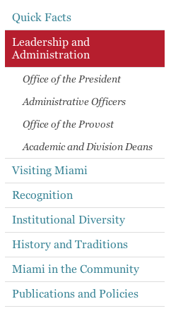 The left navigation uses the Georgia font and the links should use the same blue color used for all links on Miami's website. The font size is 120%. There is also a thin border, 1px solid #DDD, between top level elements.
The hightligted element, which indicates the current page the visitor is on, has a red background #B61E2E with white #FFF text. A class of "selected" is added to the list item to apply this look.
The second level of navigation, or sub-navigation, uses the Georgia Italic font. The color is dark gray #444 and there is no border between elements. The font size is 100%.
The example in the image to the right can be found on the Leadership and Administration page under About Miami, look at the left column below the header.