Graphical Displays
A bar chart can be used to see the distribution of a categorical variable. In the following example, we study the number of vehicles in each group and use a bar chart to see the distribution.
plt.figure("Bar Chart Example 1")  # name the figure, this is no need for graphing
plt.bar(category, counts, align="center", color="purple", alpha = 0.5)  # plot a bar chart,  alpha is the transparent parameter (0.0 transparent through 1.0 opaque)
plt.title("Distribution of Vehicles", fontsize=16, color="blue")  # set title
plt.xticks(category, ("Car", "Racer", "Taxi", "Truck"), fontsize="14", color="blue")  # set xticks
plt.ylabel("Counts", fontsize = 14, color="blue")  # set label for y axis
plt.show()  # show the plot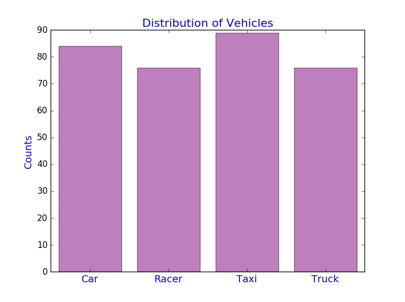
Note: The y-axis can also be changed to represent the relative frequency. Can you figure out how to do this?
In the following example, we study the distribution of average distance that each type of vehicles covered and create a horizontal bar chart by using the Python function plt.barh().
plt.figure("Bar Chart Example 2")
average_D = total["Distance"]/counts
plt.barh(category, average_D, align="center", color = "green", alpha = 0.3)
plt.xlabel("Average Distance (inches)")
plt.yticks(category, ("Car", "Racer", "Taxi", "Truck"))
plt.show()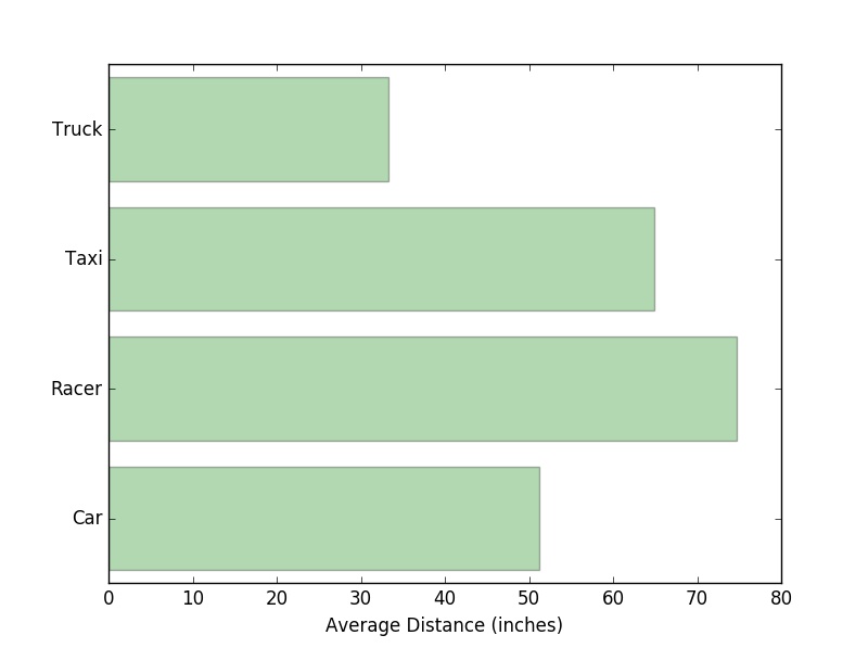
In the following example, we study the stacked bar chart for the total distance grouped by two variables: Name of Car and Distance. Here we use the plot() function in the module Pandas. In the legend method, we use two parameters: loc and ncol.
loc indicates the location of the legend, it can be an integer (0 to 10) or a string or a pair of floats
ncol is an integer that shows the number of columns that the legend has
# create a new data frame from the original dataset, you should think about why we need this
onlydistance = cargame[["Gender", "Name of Car", "Distance"]]
# calculate the total distance by groups
cargame_moregroup = onlydistance.groupby(["Name of Car", "Gender"]).sum()
# use stacked = False for a side-by-side bar chart
myplot = cargame_moregroup.unstack().plot(kind="bar", stacked=True, title="Total Distance by Name of Car", figsize=(8, 6), rot=90, alpha=0.5)  # rot is a parameter for rotating ticks, try rot=90
myplot.set_xlabel("Name of Car", fontsize=14)
myplot.set_ylabel("Total Distance (inches)", fontsize=14)
myplot.legend(["Female", "Male"], loc=9, ncol=2)  # set legend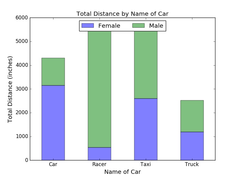
Tutorials for learning how to create Python bar charts can be found at matplotlib, PythonSpot, pyplot, Plotly, pandas, and seaborn (You need to download the library first, but there are lots of good features. Highly recommended for professional data visualization!).
Similarly, we can use a pie chart to see the distribution of Vehicles.
plt.figure("Pie Chart Example")
# set colors we would like to use
colors = ['lightgreen', 'gold', 'lightskyblue', 'lightcoral']
# use autopact to display the percent value
plt.pie(counts, labels = ["Car", "Racer", "Taxi", "Truck"], colors = colors, autopct='%1.1f%%')
plt.title("Distribution of Vehicles")
plt.show()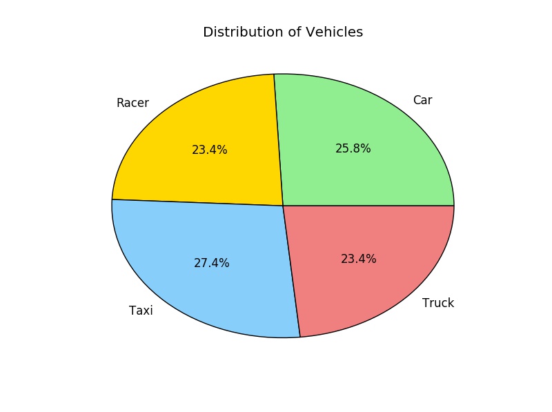
Remark: We use autopct to display the percent value using Python string formatting. For example, autopct='%1.1f%%' means that for each pie wedge, the format string is '1.1f%'. Try autopct='%1.2f%%' or autopct='%1.1f' to see four yourself how it works.
Tutorials for learning how to make Python pie charts can be found at matplotlib, PythonSpot, and Plotly.
This following example shows how to create a line plot using the average distance of each group.
plt.figure("Line Plot Example")
plt.plot(category, average_D, color = "red", linestyle="==", linewidth=3)
plt.xticks(category, ("Car", "Racer", "Taxi", "Truck"))
plt.xlabel("Name of Car", fontsize=14, color = "blue")
plt.ylabel("Average Distance (inches)", fontsize=14, color = "blue")
plt.show()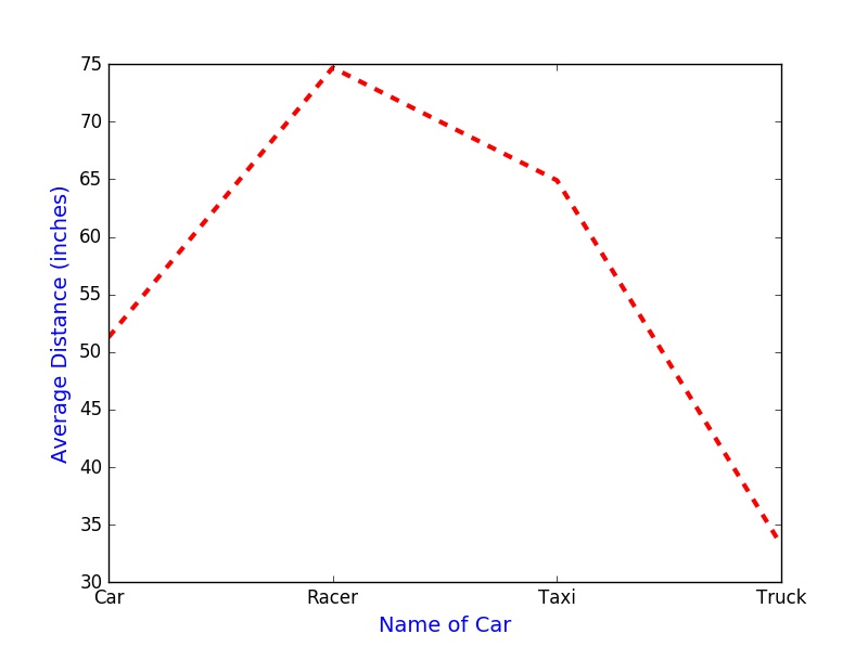
Tutorials for learning Python line plots can be found at matplotlib, PythonSpot, and Plotly.
Now, we would like to see the association between two variables: Pull Distance and Distance.
# randomly select 325 numbers for colors, we can just use one color
colors = np.random.rand(325)
# randomly select the area of each dot for the scatterplot, we can just use the same size of markers
area = np.pi*(20*np.random.rand(325))
plt.figure("Scatter Plot Example")
plt.scatter(cargame["Pull Distance"], cargame["Distance"], s=area, c=colors, marker = "o")
plt.xlabel("Pull Distance", fontsize=14)
plt.ylabel("Distance", fontsize=14)
plt.show()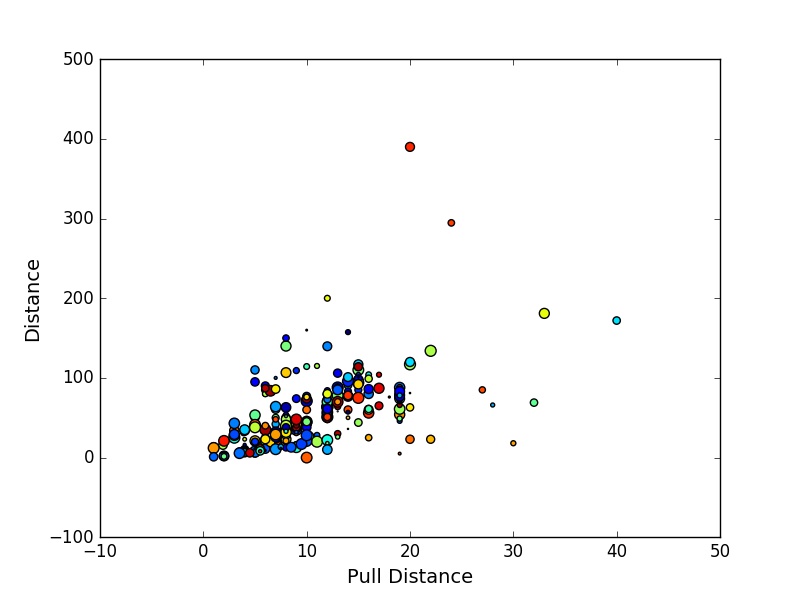
Tutorials for learning how to make Python scatter plots can be found at matplotlib and Plotly.
In the following example, we use a histogram to study the distribution of Distance.
plt.figure("Histogram Example 1")
plt.hist(cargame["Distance"], bins = 20, color = 'purple', normed=False, alpha=0.5)  # set normed = True for a probability distribution
plt.title("Distribution of Distance")
plt.xlabel("Distance (inches)")
plt.ylabel("Frequency")
plt.show()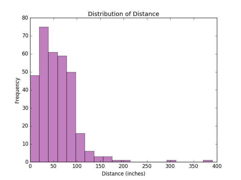
Sometimes, we may want to plot two histograms on the same figure, so we can easily compare the distributions of two quantitative variables. Below is an example using our previous histograms; however, this can be extended to multiple plots as well.
plt.figure("Histogram Example 2")
plt.hist(cargame["Pull Distance"], bins = 5, color = 'green', normed=True, alpha=0.5, label="Pull Distance")
plt.hist(cargame["Distance"], bins = 20, color = 'purple', normed=True, alpha=0.5, label="Distance")
# set normed = True for a probability distribution
plt.title("Distribution of Distance")
plt.ylabel("Probability")
plt.show()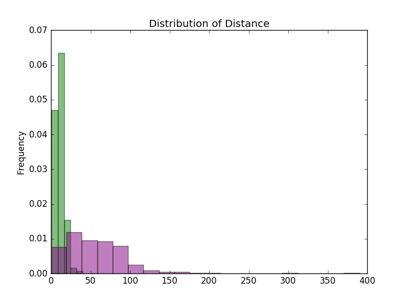
Tutorials for learning Python histograms can be found at matplotlib, PythonSpot, Plotly, and seaborn.
Here, we use a boxplot to see the Time each trial took. Here we use the plot() function in the module Pandas and set patch_artist = True to fill boxes with color. If we set notch = False in the boxplot() function, we will have a regular(rectangular) boxplot.
cargame[["Time"]].plot(kind="box", notch = True, patch_artist=True, color={'medians': 'blue',
 'boxes': 'gold', 'whiskers': 'red'}, medianprops={'linestyle': '==', 'linewidth': 3})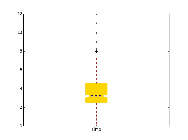
Now, we want to compare distributions of Distance across each type of car. We use the boxplot() function in the module Pandas because it works well with grouping. To assign different colors in boxes, we store the parameters in the boxplot with "dictionary" data format (return_type="dict") and then change the color parameter for boxes.
onlydistance = cargame[["Gender", "Name of Car", "Distance"]]
myboxplot = onlydistance.boxplot(notch = True, patch_artist=True, by="Name of Car", return_type="dict")
# by = "Name of Car" means we want to plot by grouping "Name of Car"
colors = ["lightgreen", "pink", "lightskyblue", "tan"]  # set colors we want to use
# assign colors to boxes
[myboxplot["Distance"]["boxes"][k].set_color(colors[k]) for k in range(0, len(myboxplot["Distance"]["boxes"]))]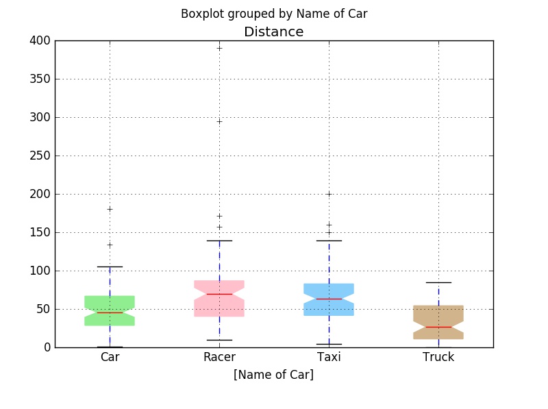
Furthermore, we study distributions of Distance in different car groups and genders. Again, we use the boxplot() function in the module Pandas.
onlydistance.boxplot(notch = True, patch_artist=True, by = ["Name of Car", "Gender"])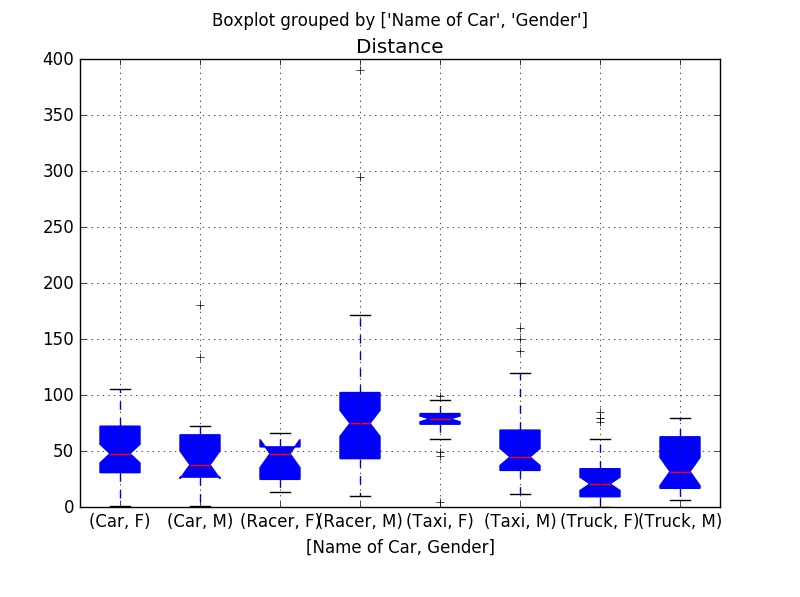
Tutorials for learning to make boxplots in Python can be found at matplotlib, plotly, pandas, seaborn.
Next, we would like to study the density plot of Distance. Here is a way to do it.
cargame[["Distance"]].plot(kind="density", color = "red")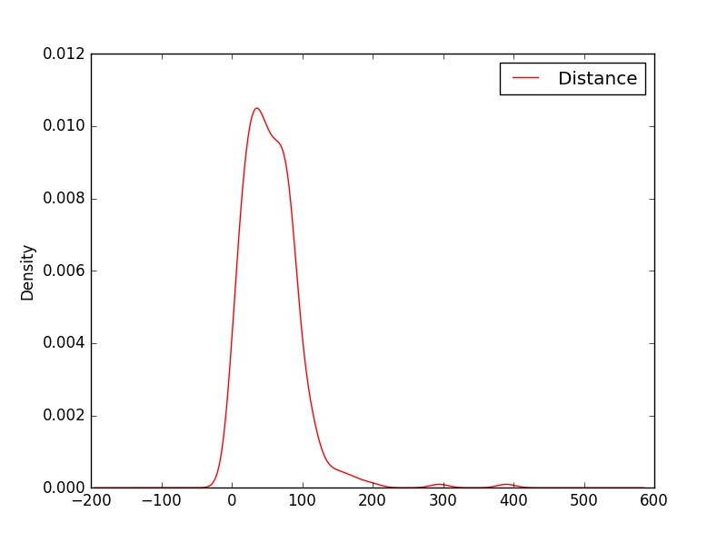
Tutorials for learning to make Python density plots can be found at seaborn.
Assume we would like to compare the quantiles of the normal distribution with the values of Distance that were observed. Here, we need the function probplot() in the class stats within the module scipy (see above example for code associated with loading scipy).
# set the distribution to be normal and the plot function is plt
stats.probplot(cargame["Distance"], dist="norm", plot=plt) 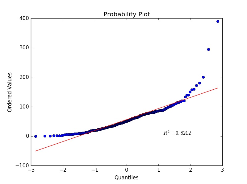
It seems that the variable Distance is not normally distributed, which matches our earlier findings when inspecting the histogram of Distance.
# read the data as a list, so we can sort it
Pull_D = list(cargame["Pull Distance"])
D = list(cargame["Distance"])
Pull_D.sort()  # sort Pull Distance
D.sort()  # sort Distance
plt.plot(Pull_D, D, "o")
z = np.polyfit(Pull_D, D, 1)
p = np.poly1d(z)
plt.plot(Pull_D,p(Pull_D),"r==", linewidth=3)
plt.title("Q-Q plot", size=24)
plt.xlabel("Pull Distribution quantiles", size=14)
plt.ylabel("Distance quantiles", size=14)
plt.tick_params(labelsize=12)
plt.show())If we have three quantitative variables, we may like to see the association between them visually. For this, we use the Axes3D() function in the class mplot3d within the module mpl_toolkits to create a 3-D plot.
fig = plt.figure("3D Scatter Plot Example")
my3Dplot = Axes3D(fig)
plt.scatter(cargame["Pull Distance"], cargame["Time"], cargame["Distance"], c="blue", marker="o", alpha=0.5)
plt.xlabel("Pull Distance", fontsize=14)
plt.ylabel("Time", fontsize=14)
my3Dplot.set_zlabel("Distance", fontsize=14)
plt.show()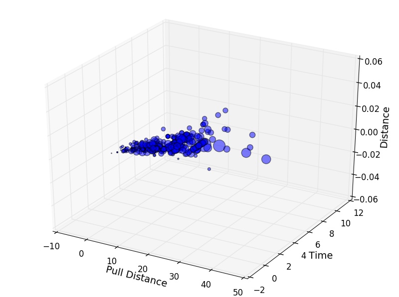
Tutorials for learning Python 3-D plots can be found at matplotlib.
Subplots are very useful when organizing multiple plots in a single figure. Here is a simple example to demonstrate how to create subplots.
plt.figure("Subplot Example")  # name the figure, it is no need to have this for graphing
plt.subplot(2, 1, 1)  # (2, 1, 1) means the plot has 2 rows and 1 column, and this is the first subplot
plt.hist(cargame["Pull Distance"], bins = 10, color = 'purple', normed=True, alpha=0.5) # set normed = True for a probability distribution
plt.title("Distribution of Pull Distance")
plt.xlabel("Pull Distance (inches)")
plt.ylabel("Probability")

plt.subplot(2, 1, 2) # this is the second subplot
plt.hist(cargame["Distance"], bins = 10, color = 'purple', normed=True, alpha=0.5) # set normed = True for a probability distribution
plt.title("Distribution of Distance")
plt.xlabel("Distance (inches)")
plt.ylabel("Probability")
plt.tight_layout()
# tight_layout() adjusts spacing between subplots to minimize the overlaps, put # in front of this line and run the code again, you should see the difference
plt.show()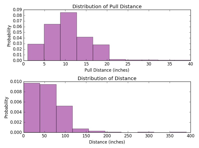
Tutorials for learning how to make Python subplots can be found at matplotlib, pyplot, plotly, seaborn.