

Professor uses statistics to help area businesses
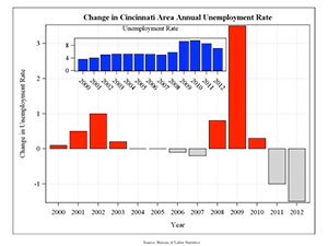
Change in Cincinnati Area, Annual Unemployment Rate
Statistical science may seem dry, but as anyone who has seen the Brad Pitt movie "Moneyball" will tell you, stats can be sexy. "Moneyball" recounts the true story of how statistician Peter Brand helped Oakland Athletics general manager Billy Beane rebuild the MLB team’s decimated player roster on a shoestring budget in the 2002 season. The Athletics went on that season to set an American League record by winning 20 consecutive games.
The kind of evidence-based decision-making popularized by Brand and Beane a decade ago is now commonplace in baseball, but isn’t always a given in other contexts. So says the chair of Miami’s statistics department, John Bailer.
A statistician with an interest and experience in data visualization, Bailer thinks the key to using information to make better decisions lies not just in the raw numbers, but also in how they are arranged and presented to decision-makers.
“We live in a world where more information is being collected at faster rates and we need to have tools and strategies for processing and understanding these data,” Bailer says. Data visualization, he continues, is about “how you represent the data in such a way that you help people use it to make decisions. You convert data into information for action.”
That is exactly what Bailer, also a distinguished professor, and students in his Advanced Data Visualization class have done this summer for several clients, including the Cincinnati Business Courier (CBC).
Like many news outfits founded in the pre-digital era, the CBC has had to adjust to the expectations of an online audience. “We’re helping with some suggestions for them to move into a new target area for their audiences,” Bailer says. “They’re trying to figure out what it means to be a reporting organization in a more digital environment.”
For example, at a recent meeting, Bailer’s students presented ideas for visualizing connections among education, employment, and projected job growth to CBC editor Rob Daumeyer ’86.
Students in the class, which was team-taught by Bailer, interactive media studies lecturer Artie Kuhn, and assistant professor of journalism Stephen Siff, turned data publicly available from the U.S. Bureau of Labor Statistics into heat maps, scatter plots, and other graphic representations that not only illustrate the current state of Greater Cincinnati’s employment market, but also highlight some bright and dark spots on the horizon.
“[Visualization] is not an organic strength of most journalists,” Daumeyer says, “so this is stuff we try to find” to help tell a story.
In addition to illustrating the stories journalists like Daumeyer already know they want to tell, data visualization can also suggest what stories need to be told next.
For the business leaders who read the CBC, knowing where to focus limited resources is critical. “We could afford to be less efficient at times when resources were plentiful,” Bailer points out, “but in times when resources become scarcer, you need to be using your information more efficiently to help support your decisions. Evidence-based decision-making leads to better decisions.”
Written by Heather Johnston, assistant director & information coordinator for the office of advancement, research and scholarship