Text Layering
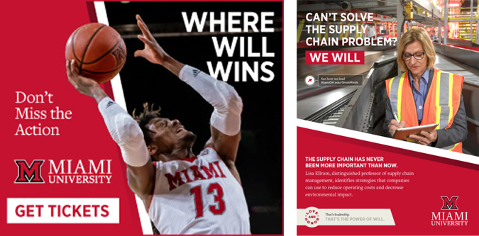
To ensure legibility of headlines over a photo, apply an outer glow set to 33% multiply (as needed). Select optical kerning for optimal alignment.
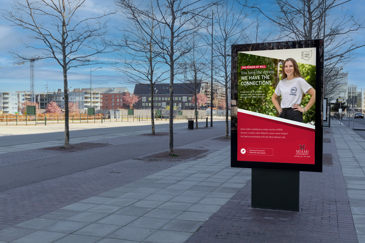

To ensure legibility of headlines over a photo, apply an outer glow set to 33% multiply (as needed). Select optical kerning for optimal alignment.

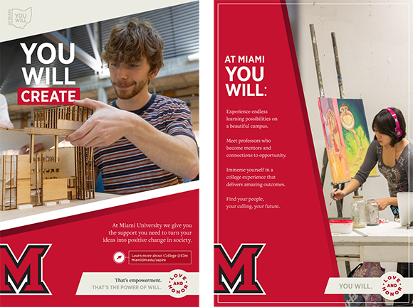
Cropping the subject out of the background of the photo and layering it over a graphic element adds depth to the page.

The state outline You Will badge may be used as an additional campaign theme reinforcement, or as a graphic element on top of a solid color.

Utilizing white or red highlight boxes can bring attention to important information on the page, or lend an extra weight to a headline.

Showing a subject active in their genuine environment introduces the audience to the excellence of learning.
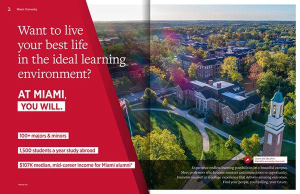
Layering photos gives it interest, and in this case, focuses the viewer on the subject. A wedge at a 168° angle with a white border or shadow gradient can be used on vertical pieces where no type overlaps the white, or a solid wedge can be used to differentiate information or badges.
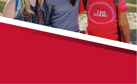
A black to transparent gradient can be added between the white border and red wedge to add another layer of depth to the subject.

The Love and Honor badge can be paired with a wedge banner to highlight additional information, or on its own as an additional themed graphic element.

The primary alternate logo (with location and established date) can be used to call attention to Miami University’s geographic location for certain audiences.
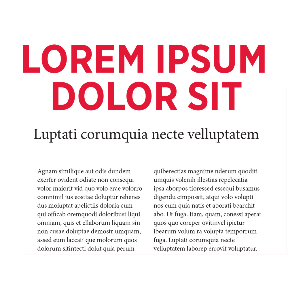
Headlines, section headers, statistics, and callouts can be set in Gotham Narrow Bold. Headlines should be set in uppercase in all instances. Examples of usage should utilize optical kerning.
FreightText Pro Book should be used for all bodies of copy, as well as a variable selection for subheads and larger text. Use FreightText Pro Book in title case or sentence case only.
