Digital Files, Websites, and Applications

Alternative Text (Alt text) is a textual alternative (non-visual) way to describe the meaning of an image. Please provide a brief one or two sentence description of all images.
Alternative text provides several services:
- Screen readers cannot analyze an image and determine what the image represents. Alternative text conveys the meaning of the image to the user.
- In cases where an image is not loaded into a web page, the alternate text is displayed instead. Some users choose not to display any images in the web browser and prefer to read the alternative text.
- Search engines use alternative text to assist in search results.
Best Practices
- Ensure that alternative text is descriptive. The file name alone is not sufficient.
- The subject matter expert should assist in determining the educational purpose of all images.
- The accepted practice for images varies depending on the use of the image. If an image is included in Canvas for educational purposes, a description of the image is required.
- Charts and graphs require a detailed explanation so that sight-impaired users can gain knowledge. Another example would be a photo of a painting for an Art History course. In addition, longer text descriptions should be provided as a caption for these images or included in the text.
- If an image does not meaningfully contribute to the page's content, then it can be more generally described or marked as a decorative image.
- Avoid using "image of" or "picture of" within the alternate text. A screen reader will automatically state "graphic" before reading the alt text.
- For images that also act as links, avoid using "click here" or "link to" in the alternative text. The screen reader will automatically state "link" before reading the description.
Using Generative AI to Compose Alternative Text
Generative AI tools have improved their ability to recognize and describe images. In addition to tools like ChatGPT and Gemini, word processing and design programs may include automatic alt text generators that can give you a starting point.
Best Practices for AI-Generated Alt Text
- Default to the Reasoning (pro) model for whatever AI tool you're using.
- For best results, write a specific prompt and request more than one output to choose from:
Using the provided photo, create three simple alt text descriptions.
Using the provided chart, create three simple alt text descriptions to summarize the results. - Improve results by adding extra descriptors, such as "write 100 words or less" or "include details of composition, color, and artistic techniques for this painting"
- Choose alt-text based on the best matches for the context and purpose of the image.
Resources for Alt Text

Color is an important asset in web content design, enhancing its aesthetic appeal, usability, and accessibility. However, some people have difficulty perceiving color. In addition, people using text-only, limited-color, or monochrome displays and browsers cannot access information presented only in color.
Best Practices
- Avoid communicating information with color alone.
- Use high levels of color contrast.
- Most accessible colors against a white background include:
- Black (or white text on a black background)
- Burnt Orange
- Very Dark Gray
- Medium to dark blue for links/hyperlinks
- Users with partial vision benefit from text attributes such as size, color, bold, italics, and underlining to draw the attention of the content.
- Use headings to delineate the hierarchy and importance of the text. Avoid using formatting styles such as bold, italics, and underline alone as ways to delineate structure.

Forms are commonly used to provide interaction on websites and in web applications. Accessible forms are easy to understand, complete, and submit. Instructions, cues, required form fields, and field formatting requirements must be clearly identified to users. Ensure that the reading and navigation order is logical and intuitive.
Best Practices
- Ensure forms are logical and easy to use
- Ensure forms are keyboard accessible
- Provide instructions for the form (i.e., “* = required form field”).
PDF or Webform?
PDF forms must be remediated to be accessible. Because of the interactivity of form fields, they usually require that additional tags be added in Acrobat Pro. They can not be made fully accessible in authoring tools (such as Microsoft Office) at this time.
If you can use a webform instead (Qualtrics, Google Forms, etc), that’s always preferable. Another option is to make the static text portion accessible and then use Docusign to add accessible form fields.
Resources for Accessible Forms

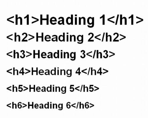
Headings provide structure to your documents. When these document structures are in place, word processing documents (such as Word or Google Docs), web documents (such as HTML pages), and other formats (such as PDF) are all more usable and navigable by assistive technology tools.
Best Practice
- Do not use font size or formatting to create headings visually. Instead, apply the built-in heading styles that your software provides.
- Documents should only include one Heading 1.
- Use proper formatting, styles, and headings in a logical order. Avoid skipping headings or using headings inconsistently.
- Headings will also create an outline or can assist in creating a table of contents.

Links should be descriptive of the content they're linking to, such as 'Class Schedule' rather than 'schedule.html' or 'click here' because many screen reader users use links to navigate the page, and providing links without text can be a barrier for these users.
Best Practices
Follow these guidelines when adding links to web pages and documents:
- Link text should describe the destination.
- Example: Learn more about our campuses and locations at Miami.
- Avoid duplicate links on pages. These links may have different descriptive text but take users to the same place.
- Avoid using generic descriptions such as “click here,” "online," "learn more," etc. These labels do not describe the function of a link. Users will NOT hear the link in the context of the sentence. Usually, the links are read separately.
- Don't underline text unless it is a link/hyperlink.
Examples of Descriptive Link Text
Poor Usage Examples
- Neil Danielson, in his paper "Multimodal liquid chromatography of small molecules," http://pubs.rsc.org/en/Content/ArticleLanding/2013/AY/c3ay40302e#!divAbstract, says Multimodal chromatography is a family of...
- Click here to access this week’s reading assignment.
- Read more about biochemistry research at Miami online.
Good Usage Examples
- Neil Danielson, in his paper "Multimodal liquid chromatography of small molecules," says Multimodal chromatography is a family of...
- Access this week's reading assignment.
- Read more about biochemistry research at Miami.

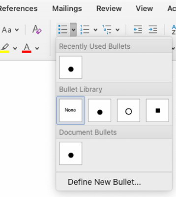
Ordered and unordered lists group together related items. If your content includes lists, make sure they are made using styles or markup language.
Best Practices
- Unordered lists are for content having no order of sequence or importance.
- Ordered lists suggest sequence, order, or ranking. List items are typically pretended with a number, letter, Roman numeral, etc.
- List structure should be used wherever a logical list is present and nowhere else. Don't merely create something that looks like a list by starting each paragraph with a bullet character.
- Don't apply list structure to elements that do not logically form a list.

Tables should be simple and structured appropriately. Tables should be used to organize and display data, not for content/page layout.
Best Practices
- Avoid merging or splitting table cells, as doing so will cause screen readers to read the table columns and rows inaccurately. Special HTML codes are used for merged cells to allow the content to be read accurately by a screen reader.
- Column and row headers provide a description of the table structure for sighted and screen reader users.
- For HTML, best practices include:
- A caption tag <caption> should be at the top of the table. The caption is visible to everyone and should describe the purpose of the table.
- Scope attributes (<th scope="col"> or <th scope="row">) in headers organize and further define table data by row/column for screen reader users.
- Table headers <th> should never be empty, but table data <td> can be empty.
| Column Heading | Column Heading | Column Heading | |
|---|---|---|---|
| Row Heading | Table data | Table data | Table data |
| Row Heading | Table data | Table data | Table data |
| Row Heading | Table data | Table data | Table data |
| Table data | Table data | Table data |

Check websites for accessibility to ensure the material can be viewed, navigated, and understood. WebAim WAVE is a free tool that can quickly scan to identify some potential barriers. The more RED errors you have on a page, the less likely you should use it. Additional manual testing should be performed.
Faculty should find and use resources that are accessible. If you use applications in the class and want to have them tested for accessibility, you can also contact AccessMU@MiamiOH.edu.
If you are a Cascade user, University Communications and Marketing provides excellent resources on Website Accessibility within the training Canvas course.
